Choose your operating system:
Windows
macOS
Linux
Every Widget Blueprint that you create with UMG is considered a User Widget that can be reused and placed within other Widget Blueprints. Both visual and scripted functionality will be carried over into the Blueprint.
With some Blueprint Scripting, you can create variables for how your UI widget functions or looks that can be overwritten on a per-instance basis. In this How-to, we will create and stylize a Button and set it up in such a way that we can override the style when we place it in other Widget Blueprints. Lastly, we will customize what happens when the Button is clicked on a per-instance basis. This is useful if you have a series of Buttons in a menu that you want to look and act the same but produce different results when pressed.
1 - Setting Up the Button Widget
First, we need to create a Button and set up the script for what happens when we click the Button.
For this how-to, we are using the Blueprint Third Person Template with Starter Content enabled.
-
Right-click in the Content Browser and create two Widget Blueprints , one called CustomButton and another called HUD .
![UserWidget01.png]()
The CustomButton is the User Widget that we will add into the HUD Widget Blueprint.
You can also add a Widget Blueprint by navigating to Content Browser > Add New > User Interface .
-
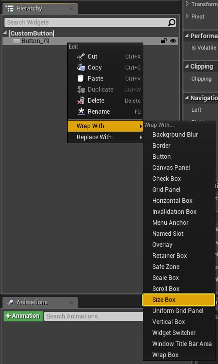
Inside the CustomButton Widget Blueprint, delete the Canvas Panel . Then, add a Button , Right-click, and select Wrap With > Size Box .
![UserWidgets_new_02.png]()
-
In the Size Box Details panel, change the Width Override to 300 and Height Override to 100 . You can also change the graph layout to Desired on Screen to get an idea of the actual size of the button.
![UserWidget03.png]()
-
In the Event Graph, hold Ctrl and drag the Button from the My Blueprint panel. Then, drag off the pin and add a Set Style node. Make sure to select the Variable Apperance node and not the Button Function node.
![UserWidget04.png]()
-
Connect the Event Construct node to the Set Widget Style node, and then Right-click on Widget Style and select Promote to Variable .
![UserWidget05.png]()
-
Name the new variable ButtonStyle and then Compile the Blueprint. Then, set the Normal > Image style to any texture.
![UserWidgets_new_06.png]()
-
Right-click on the Normal section and select Copy . Then, paste the image settings to the Hovered and Pressed values. All three of these values should now have the same image texture.
![UserWidgets_new_07.png]()
![UserWidgets_new_07.2.png]()
-
Expand Hovered and change the Tint color to any color (such as yellow).
![UserWidgets_new_08.png]()
-
In the ButtonStyle , check Instance Editable and Expose on Spawn .
![UserWidgets_new_09.png]()
This enables us to modify the values of this variable from other Widget Blueprints when we use this Widget Blueprint elsewhere.
-
Select the Button variable, and click the + sign to add an OnClicked node to the graph.
![UserWidgets_new_10.png]()
-
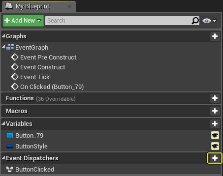
In the MyBlueprint panel, select + Event Dispatcher to create a new Event Dispatcher and call it ButtonClicked .
![UserWidgets_new_11.png]()
-
Drag the ButtonClicked event into the graph, select Call , and connect the node to the OnClicked event.
![UserWidget11.png]()
This creates a unique script functionality when we click the button. If we had multiple instances of this button and only used the OnClicked event, each instance would respond and execute the same functionality. However, by creating an Event Dispatcher , we can implement events on a per-instance basis and have only the button that was actually clicked on fire off an additional script.
2 - Adding the Button Widget to the HUD Widget
With our Button widget created and scripted, we can now add the Button to the HUD Widget, add the HUD to the viewport, and see the buttons in-game.
-
Open the HUD Widget Blueprint, and add a Vertical Box to the Canvas Panel . Resize the box to a smaller size.
![UserWidget12.png]()
-
From the Palette under User Created , add three Custom Buttons to the Vertical Box .
![UserWidget13.png]()
-
In the Event Graph, select each CustomButton and click + to add the Button Clicked event to the graph. You should have three events, one for each button.
![UserWidgets_new_15.png]()
This is the Event Dispatcher that we created inside our CustomButton Widget Blueprint and will respond whenever this particular button is clicked.
-
For each ButtonClicked event, drag off the pins and connect Print String nodes up to each event. Add different text to the In String text boxes.
![UserWidget16.png]()
In this example, we are printing different text to the screen depending on which button we click. In a real-world example, you can have each button open up a different menu, change different game settings, or make modifications to a player character.
This how-to simulates clicking a button for example purposes. To learn how to make HUD menu, see Creating a Main Menu in the UMG UI Designer Quick Start Guide.
-
From the Level Editor Main Toolbar, go to Blueprints and select Open Level Blueprint .
![UserWidget17.png]()
-
Right-click in the Event Graph and add an Event BeginPlay node. Connect the node to a Create Widget node with the Class set to HUD .
![UserWidget18.png]()
-
Add an Add to Viewport node and connect it to the Create HUD Widget node. Then, add a Get Player Controller function to a Set Show Mouse Cursor node and check the box (set it to True).
![UserWidget19.png]()
-
Compile , Save , close the Level Blueprint , and click Play in the editor to interact with your button in-game.
End Result
When playing in the editor, each Button is automatically styled based on the defined ButtonStyle variable, and they execute a different portion of the script as the Event Dispatcher is called and the corresponding ButtonClicked Event is called. Since our ButtonStyle variable is exposed and editable on spawn, we can override the style of the button in whatever Widget Blueprint we place it in. This is useful if you have some kind of animation or other complex scripted logic that you don't want to re-create in each Blueprint. By creating your button as a User Widget, you can reuse it in any other Widget Blueprints without additional work.
