Choose your operating system:
Windows
macOS
Linux
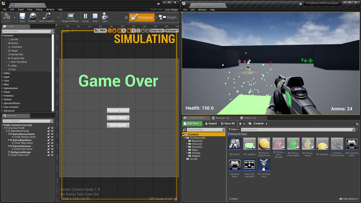

When it comes to creating your UI screens through UMG, arranging the layout of your elements is only the beginning. For each of your Buttons, Bars, Text Boxes, etc. there are several Style options that can be assigned directly within UMG from the Details panel that can affect the way that they appear.
Each of the Widgets below utilize the Style option, however their individual Style options may vary:
-
Button
-
Check Box
-
Editable Text Box
-
Multi Line Editable Text Box
-
Progress Bar
-
Size Box
-
Slider
-
Spin Box
-
Text Block
-
Combo Box (String)
-
Editable Text
-
Multi Line Editable Text
States
There may be instances, particularly with interactive Widgets, that you want to convey a different look for your Widget based on how it is interacted with or the condition it is in. For example, say you have a button on screen that appears normally and when moused over, changes colors or pulsates, then when clicked does something entirely different. Referred to as States , this is the most common form of styling and allows you to specify how the Widget appears based on the current state it is in.

Above, a Button Widget changes based on its Normal, Pressed, Hovered, or Disabled States. Most Widgets will use the Normal, Pressed, Hovered, and Disabled States, however there may be additional options based on the type of Widget you are using.
Setting Image States
For each state, you can set an Image (either a Texture or Material asset) for the Widget to use. Image Size refers to the size of the resource in Slate Units and the Draw As option, which uses a 9 Scale Box, allows you to specify how the image is drawn in the form of a Box , Border , or an Image .
Examples of each are provided below:
|
|
|
|
|---|---|---|
|
Box |
Border |
Image |


-
The Box draws a 3x3 box where the sides and the middle Stretch (orange arrows) based on the Margins (dotted blue lines).
-
The green arrows represent constant values based on the Margin x Image Size.
-
-
The Border draws a 3x3 border where the sides Tile (orange arrows) based on the Margins (dotted blue lines).
-
The middle is not drawn when using a Border.
-
The green arrows represent constant values based on the Margin x Image Size.
-
-
The Image will draw the image and will Stretch (orange arrow) and the Margin will be ignored.
Texture Based Images
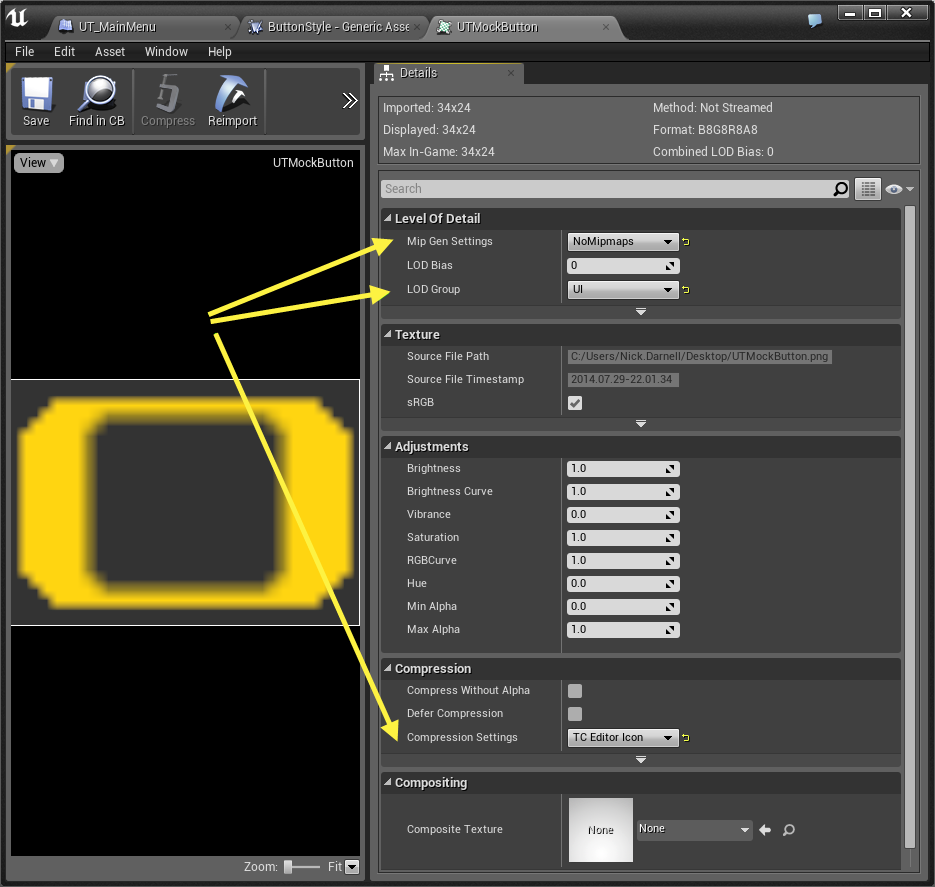
You can assign Textures as your Image asset, but there are some flags you will want to set in order for the Texture to show up on every device, and to show up crisp and without compression artifacts. Inside the Texture Edtior under Level Of Detail, set
Mip Gen Settings
to
NoMipmaps
and set the
LOD Group
to
UI
. Under Compression, set the
Compression Setting
to
TC Editor Icon
.
Click for full view.
Material Based Images
Materials can also be assigned as the Image asset for your Image States, but you will need to change a few settings. Inside the Material, in the Details panel under Usage , you will need to check the Used with UI checkbox. This enables compiling a different shader specifically for Slate. You also need to only output Emissive Color .
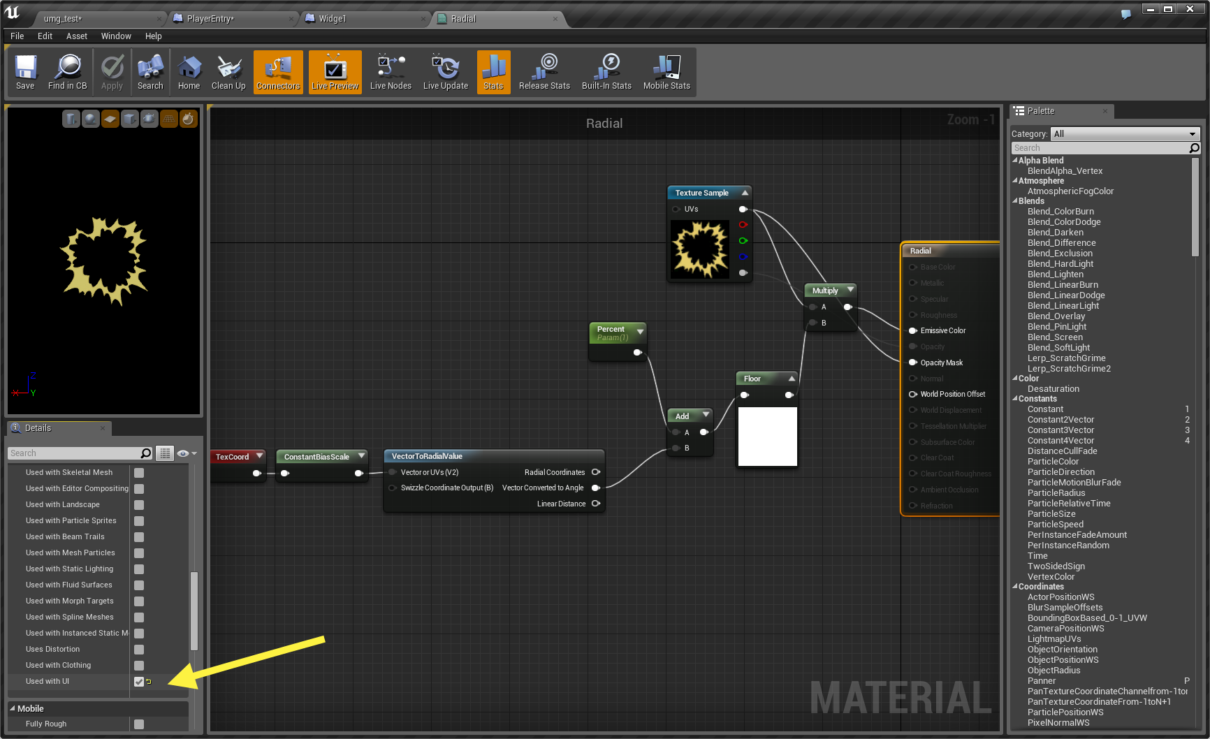
Click for full view.
Dynamic Materials
In order to modify Material Parameters, you need a Dynamic Material Instance . The Image Widget makes this especially easy as long as it has a Slate Brush on it with a Material, you can ask for the dynamic image (only creates it once and then caches it).

Tint / Margin
Also under each State is the option to
Tint
the image, which allows you apply a tint color to the supplied image associated with the state. There is also a
Margin
option which allows you to enter a margin size for the
Box
and
Border
draw modes (in Image mode, margin is ignored).
Padding
The Padding styling option refers to the border created around aspects of the Widget.

For example, in the image above for a Box Button, Normal Padding accounts for the border in the button's background image. When it is applied, the content of the button will appear flush with the button's border. Pressed Padding is the same as Normal Padding, however it refers to the padding applied when the button is pressed.
Based on the type of Widget you are using, different Padding options may be available.
Sounds
Sounds can be set for your Widgets based on the State the Widget is in.

Most Widgets that allow sounds to be applied make use of the Hovered or Pressed Sound Events, which play the specified sound when hovering over the Widget or clicking on the Widget. In the image above for a Check Box Widget, there is the option to set sound events for Checked and Unchecked as well as Hovered .
Based on the type of Widget you are using, different Sound options may be available.
Render Transform

There are additional styling options that can be used to modify the look of your Widgets found under the Render Transform section of the Details panel for your Widget. With the Render Transform settings, you can Translate , Scale , Shear , or Angle your Widgets as well as adjust its Pivot point.
Samples of Render Transform settings are illustrated below.

Each of the Render Transform settings can be Keyframed allowing you to modify them with Animations and they can also be modified through Blueprints allowing you to make modifications during or based on gameplay actions performed by the user. Render Transforms are relative to Layout Transforms and are not clipped by their parent (for example if you had a Scroll Box full of Buttons, adjusting the Translation in the Render Transform settings could push the Button outside of its box).