Choose your operating system:
Windows
macOS
Linux
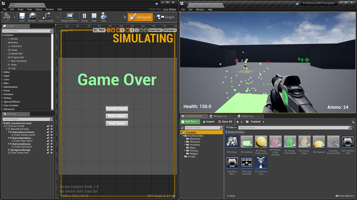
Inside the Widget Blueprint Editor , located under the Palette window, there are several categories of Widgets , each of which contains different Widgets Types that you can drag-and-drop into the Visual Designer . By mixing and matching these Widget Types, you can layout the look of your UI on the Designer tab and add the functionality to your Widgets through the settings in the Details panel for each Widget and via the Graph tab.
Listed below are each of the Widget Types under the Palette window:
Click the Widget Type (where applicable) for a usage guide along with more information on the Widget itself.
Common

The most frequently used Widgets will more than likely fall under this category.
|
Option |
Description |
|---|---|
|
Border |
A border is a container widget that can contain one child widget, providing an opportunity to surround it with a border image and adjustable padding. |
|
Button |
The button is a single-child, click-able primitive widget which enables basic interaction. You can place any other widget inside a button to make a more complex and interesting clickable element in your UI. |
|
Check Box |
The Check Box widget allows you to display a toggled state of 'unchecked', 'checked', and 'indeterminable'. You can use the Check Box for a classic check box, as a toggle button, or as radio buttons. |
|
Image |
The image widget allows you to display a Slate Brush, Texture, Sprite, or Material in the UI. Sprites that are part of the same texture atlas can be batched together in Slate, provided they all share the same layer when rendered. This means that platforms, where the draw call count budget is tight, will render UMG and Slate Widgets significantly more efficiently if Paper2D Sprites are used as Brush inputs. |
|
This widget allows you to expose an external slot for your User Widget that can be populated with any other widgets and is useful for creating custom widget functionality. |
|
|
Progress Bar |
The progress bar widget is a simple bar that fills up and can be restyled to fit any number of uses such as Experience, Health, Points, etc. |
|
Slider |
A simple widget that shows a sliding bar with a handle that allows you to control the value between 0-1. |
|
Text |
The basic method for displaying text on screen and could be used for text descriptions of options or other UI elements. |
|
Text Box |
Allows the user to type in custom text. Only permits a single line of text to be entered. |
Extra

This section contains widgets that complement other widgets.
|
Option |
Description |
|---|---|
|
Expandable Area |
Allows you to collapse or expand children widgets within a container. |
Input

There are a couple of options on how to allow Input from a user which are outlined below.
|
Option |
Description |
|---|---|
|
Combo Box (String) |
The combo box (string) allows you to display a list of options to the user in a dropdown menu for them to select one. |
|
Spin Box |
A numerical entry box that allows for direct entry of the number or allows the user to click and slide the number. |
|
Text Box (Multi-Line) |
Similar to the Text Box but allows a user to enter multiple lines of text instead of a single line. |
Optimization

The widgets contained here are primarily used for optimizing your UI for better performance.
|
Option |
Description |
|---|---|
|
Widgets that are wrapped with an Invalidation Box allows the child widget geometry to be cached to speed up Slate rendering. Any widgets that are cached by an Invalidation Box are not pre-passed, ticked, or painted. In general, if you are looking to optimize your project, wrapping certain widgets with Invalidation Boxes may boost your performance (particularly for mobile projects or complicated UI displays). For widgets that do not change constantly, they can be placed inside an Invalidation Box and cached instead of considered during paint, tick, or prepass. |
|
|
Retainer Box |
Renders children widgets to a render target first before later rendering that render target to the screen. This allows both frequency and phase to be controlled so that the UI can actually render less often than the frequency of the main game render. It also has the side benefit of allowing materials to be applied to the render target after drawing the widgets to apply a simple post process. |
Panel

The Panel category contains useful Widgets for controlling layouts and placing other Widgets.
|
Option |
Description |
|---|---|
|
Canvas Panel |
The canvas panel is a designer-friendly panel that allows widgets to be laid out at arbitrary locations, anchored, and z-ordered with other children of the canvas. Note that, although z-order can be altered manually, widgets are rendered in list order, and it is considered preferable to order them correctly in the list rather than to rely on z-ordering. The canvas panel is a great widget for manual layout, but not as useful when you want to generate widgets procedurally and place them in a container (unless you want an absolute layout). For more information on Anchors, see the Anchors page. |
|
Grid Panel |
This is a panel that evenly divides up available space between all of its children widgets. |
|
Horizontal Box |
Allows child widgets to be laid out in a flow horizontally. |
|
Overlay |
Allows widgets to be stacked on top of each other and uses a simple flow layout for content on each layer. |
|
Safe Zone |
Pulls the platforms Safe Zone info and adds padding. |
|
Scale Box |
Allows you to place content with a desired size and have it scale to meet the constraints placed on this box's allotted area. If you needed to have a background image scale to fill an area but not become distorted with different aspect rations, or if you need to auto fit some text to an area, this is the control for you. |
|
Scroll Box |
An arbitrary scrollable collection of widgets. This is great for presenting 10-100 widgets in a list. This does not support virtualization. |
|
Size Box |
Allows you to specify the size it reports to have and desire. Not all widgets report a desired size that you actually desire. Wrapping them in a Size Box lets you have the Size Box force them to be a particular size. |
|
Uniform Grid Panel |
A panel that evenly divides up available space between all of its children. |
|
Vertical Box |
A vertical box widget is a layout panel allowing child widgets to be automatically laid out vertically. This is great for stacking widgets on top of each other and keeping widgets aligned vertically. |
|
Widget Switcher |
A widget switcher is like a tab control but without the tabs which you can create on your own and combine with this to get a tabbed effect. At most, one widget is visible at a time. |
|
This widget arranges child widgets from left-to-right and widgets exceed that the Width, will be placed on the next line. |
Primitive

The Widgets contained in the Primitive category provide additional methods of conveying information to the user or allowing them to select things.
|
Option |
Description |
|---|---|
|
Circular Throbber |
A throbber widget that orients images in a spinning circle. |
|
Editable Text |
This a text field that allows for user input without a box background. This only supports a single line of editable text. |
|
Editable Text (Multi-Line) |
Similar to Editable Text but supports multiple lines of text instead of a single line. |
|
This widget allows you to specify a location that a popup menu should be anchored to and should be summoned from. |
|
|
Native Widget Host |
This is a container widget that can contain one child Slate widget. This should be used when all you need is to nest a native widget inside a UMG widget. |
|
Spacer |
A spacer widget provides custom padding between other widgets. The spacer does not have a visual representation and is invisible in game. |
|
Throbber |
An animated throbber widget that shows several zooming circles in a row (could be used to signify loading for example). |
Special Effects

These widgets are used to generate UI based special effects.
|
Option |
Description |
|---|---|
|
The Background Blur Widget can contain one child widget, providing an opportunity to surround it with adjustable padding and apply a post-process Gaussian blur to all content beneath the widget. |
Uncategorized

The widgets in this section are considered as a special case and do not fall in with other categories.
|
Option |
Description |
|---|---|
|
Input Key Selector |
A widget for selecting a single key or a single key with a modifier. |
|
Window Title Bar Area |
A panel for defining a region of the UI that should allow users to drag the window on desktop platforms. |
User Created

User Created Widgets are Widget Blueprints you have created that you can place inside another Widget Blueprint. This is useful for creating "parts" of UI elements as individual Widget Blueprints, then adding them together to construct your overall UI layout.
For example, you could create a Player Health widget that contains display information for the player's health, an Inventory widget that keeps track of the players collected items, an Action Bar widget that allows the player to press a button and perform different actions or any number of other types of widgets, bringing them all together under one GameHUD widget where those individual pieces are toggled on/off as needed (rather than constructing them all in a single Widget Blueprint).
Experimental

These widgets are considered to be in the early stages of development and in order to access them, you will need to enable them from the Plugins menu under Widgets .
|
Option |
Description |
|---|---|
|
Web Browser |
This widget is used to display an in-game web browser that can host content from anywhere on the web. |
