
Using Mobile Service Leaderboards
Using leaderboards in your game.
Choose your operating system:
Windows
macOS
Linux
The UI for the Unreal Match 3 sample game was constructed through UMG UI Designer and Blueprint Visual Scripting . There are several different UI elements conveyed in this sample from front end menus to in-game HUDs and the approach to constructing each were designed with mobile devices in mind.
On this page we highlight each of the menus and point out considerations made during construction, discuss things to be aware of when generating art for UIs, how to approach setting up your UI to scale for different mobile devices and aspect ratios, the steps taken to optimize the UI as well as tips & tricks that were used that may help or speed up your workflow.

The Title Screen can be found inside the Content/UI folder as the TitleScreen Widget Blueprint. It primarily consists of some Text widgets and a Button that animates. When the player clicks on or presses the button, they are then taken to the game's Main Menu. In the Graph we use a Timer to call and play the pulse animation every 5 seconds. When clicking the button, the Main Menu Widget Blueprint is created and added to the viewport before removing the Title Screen.
The setup for the Button used on the Title Screen is used quite frequently throughout the sample.

Here we wrapped a Button with a Scale Box so that we may scale the whole thing linearly. The Button itself has its Hovered, Normal and Pressed states assigned to use the green button background. We then used an Overlay wrapped Scale Box containing an Image (the icon) so that we may scale the icon independently of the overall button size.
We elected not to bake the icons directly into the backgrounds so that we can interchange them around if need be or use different backgrounds down the road which makes them more easily interchangeable.

The Main Menu can be found inside the Content/UI folder as the MainMenu Widget Blueprint. The hub in which the player can perform several different actions, this screen contains 10 different buttons which allow the player to access settings, access the in-game store, play the game, select levels, etc. When playing on a mobile device, depending on the platform (Android or iOS), the player can access platform specific leaderboards and achievements.
The Graph for this Widget Blueprint is setup so that when the player clicks on one of the buttons that will transition to a new screen menu screen (settings, level select, store, etc.), we first check and see if the player has access that screen before and if not, we then create the corresponding Widget Blueprint to display and store that as a variable for the next time they access that screen. This prevents us from having to create/destroy each screen each time the user accesses it.
One of the design decisions made in setting up this screen concerns how the buttons across the top and bottom are laid out.

The decision was made to use a Uniform Grid Panel to hold each of our buttons rather than a Horizontal Box (which we could have just as easily done). What this allows us to do is specify in the Details panel the amount of Slot Padding to add to each Child that is added (rather than doing so on each button that is added individually). On our Buttons, all we need to do is center them up and they will be spaced out evenly inside the grid panel.


The Options Menu can be found inside the Content/UI folder as the OptionsMenu Widget Blueprint. As seen in the images to the left, the Options Menu is repurposed and used in both the Main Menu and in-game display whenever the Options Button is pressed. Based on the context, the content changes slightly and additional options are presented and stylized treatments are used.
The Graph for this Widget Blueprint contains the logic for loading/saving the options that are changed and is handled by the Global Game Instance Blueprint. We also check to see if the player is accessing the options from in-game or the Main Menu and swap out the buttons displayed at the bottom or enable/disable a background tint.
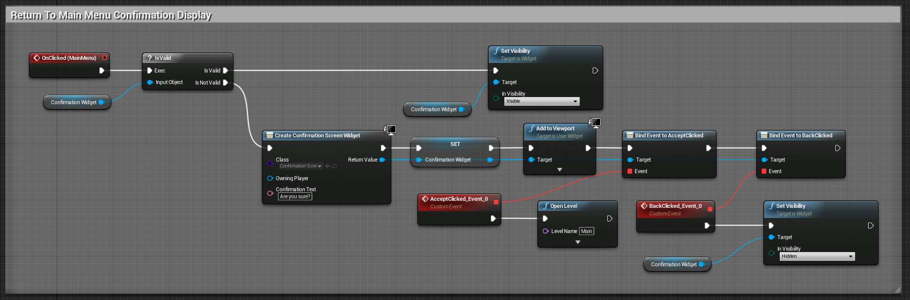
The in-game Options Menu is one of the instances where a Confirmation Screen is used upon performing certain actions. It's usually best practice to provide a confirmation of "destructive" actions whenever you create your UI screens (quitting games, purchasing items, deleting items, etc.) to prevent users from inadvertently selecting something or performing an action they didn't mean to.
Since this screen is used quite a bit throughout the project, we've created a separate Widget Blueprint called the ConfirmationScreen (located in the Content/UI folder) that we can call to be displayed whenever we want to provide a method for the player to cancel out of an action they've selected. Below is the script used inside the OptionsMenu Widget Blueprint that creates/displays the widget and binds the Accept and Back Buttons to perform actions we want to take for the Options Menu.
Click for full view.

The primary in-game HUD is contained within the GameScreen Widget Blueprint in the Content/UI folder. This Widget Blueprint defines the layout for the individual pieces that make up the overall display: the ScoreBoard ( ScoreBoardWB Widget Blueprint) and Bomb Power ( PowerBarHorz Widget Blueprint) and the Settings Button (which displays the OptionsMenu Widget Blueprint).
The Graph for the GameScreen Widget Blueprint contains only the logic for displaying the Options Menu. The logic for updating the Score Board and Bomb Power meter are handled in their respective Widget Blueprints to make things more modular and easier to decipher (versus placing everything in one Widget Blueprint).
The Score Board Widget Blueprint displays the game critical information such as current score, time remaining, top score and points needed to earn a medal. The Time and Score values change frequently during gameplay (unlike the Top Score or Medal Scores). For the Time display, a Size Box is used to fit the header text and time value at a fixed position. Similarly, the score display uses a Horizontal Box with the header set to Auto and the value set to Fill . The Horizontal Box itself is also set to fill horizontally which provides a fixed a layout for the varying scores that will be displayed.

Another decision that was made regarding the score board was moving the updating of information to Event Based updates rather than relying on Tick to update everything constantly. This is a huge savings as we no longer need to check every frame if the score has been updated or if the timer value has changed. To go along with this we also used an Invalidation Box to cache the wood background pieces. This way we draw those pieces once and cache them so that we don't have to redraw them every frame (another savings).
Regarding the handling of the Bomb Power Meter display ( PowerBarHorz Widget Blueprint) a Size Box is used to override and enforce custom Width/Height values. A Material is used for the Fill Image of the Progress Bar ( M_JaggedRockFire_MeshEmit_Lit located in the Content/Materials folder).

Similar to the Score Board, the Progress Meter is updated with Events rather than Tick which is more cost effective.

Filling the progress bar is done with the Set Percent function and is being set in 20% increments (retrieved from the Match 3 Game Mode).
The floating text that appears when scoring is handled through several different Blueprints. The first is the FloatingScore Widget Blueprint (also in the Content/UI folder) which handles the text displayed. The second, the FloatingScoreBP inside the Content/Blueprints folder is an Actor that is spawned which contains a 3D Widget Component based off the FloatingScore Widget Blueprint. When this Actor is spawned, a delay is performed before calling an animation to fade out the text then destroy the spawned Actor (pictured below).

Determining where to spawn the Floating Score is a combination of the GameLevel_GM Blueprint ( Content/Blueprints folder) and the Tile_BP Blueprint ( Content/Blueprints/Tiles folder). Inside the Tile_BP, an event is used to determine when a match is attempted. If it results in a score being awarded the location of the match is passed to the GameLevel_GM which handles the amount of points awarded before spawning the Floating Text at the match location.

Above in the GameLevel_GM , the score is defined and the process of spawning the floating text at a match location is initiated.


The Game Over screens (You Win and You Lose) can be found inside the Content/UI folder as the VictoryScreen Widget Blueprint. The same Widget Blueprint is called when the game is over but is updated based on the results of the session.
If you win, the blue background and the medal that you achieved is displayed. If you lose, the red background is displayed and the text content is replaced with the corresponding "you lose" text.
Regardless of whether or not you win or lose, the score you achieved is displayed along with a series of buttons that allow you to return to the Main Menu, show platform specific Leaderboards or Achievements or replay the level.
The buttons that appear at the bottom of the screen are located inside the GameOverButtons Widget Blueprint. They are split off from the Game Over Screen widget so that they can be repurposed and used on other screens versus having to recreate that setup each time we need display those options to the user.


The Level Select Menu can be found inside the Content/UI folder as the LevelSelect Widget Blueprint. This screen allows the player to cycle between the levels in the game as well as the scores needed for the level to earn each medal.
While the core functionality for navigating this screen exists in the Level Select Widget Blueprint, the information however is piped through a different Widget Blueprint called the LevelSelectWidget also located in the Content/UI folder.
If the user has not purchased the level, we swap out the Accept Button with a link to the Store so the user can jump directly to the Store menu to purchase it.
The Level Select Widget was created so that we can store all information in a single source with publically exposed variables so it is easier to add levels down the road. Doing so in this manner, you don't have to hunt through the Level Select Widget Blueprint and find where things need to go or worry about formatting anything, just provide the information directly from the Details panel of the Widget Blueprint you implement it in.

Above via the Details panel you can set the values for the aspects that correspond to the level.
With this setup, it is open for you to use it in different ways. You could add Level Select Widgets for each of your levels, define the default values for the information to display for each level, then turn on/off the visibility of each Level Select Widget as you cycle through your menu. The other way is to have one Level Select Widget, and then through script update the information that is piped through the widget (this is the implementation for Unreal Match 3).

Above we created a function that we can push through values to display (here we are using a Macro to get the Leader Board Scores).

The How To Play screen exists in the Content/UI folder as the HowToScreen Widget Blueprint. This screen gives a description of how to play the game and is fairly simplistic in layout. It consists of several Text widgets used for the text and the screen is laid out and formatted the same way as the Main Menu for consistency.
As with several other screens, the How to Play screen does implement some special functionality that is a requirement for Google Play Store certification, being able to back out of screens with the devices "back" button.
As an Android app requirement, being able to back out of each screen with the device's back button must be implemented for each screen. Widget Blueprints cannot directly access input functions which are typically found inside Blueprints like Player Controllers, Characters or even Actors. Therefore we use the Match3PC Player Controller ( Content/Blueprints folder) where the Android Back command calls an Event Dispatcher that we can then bind to in each of our menus where we need to provide that functionality.

Be sure to set Execute when Paused to true if you want to be able to perform an Input Action when your game is paused.
Below is the script used to provide the Android Back Button functionality to the How To screen.

Here we are binding an event to the Event Dispatcher called from the Match 3 PC Blueprint when the Android Button is pressed. We then make sure that the How To screen is visible with a Branch node before setting the Main Menu Widget to visible and the How To screen to Hidden.

The Store screen can be found in the Content/UI folder as the StoreScreen Widget Blueprint. The layout of this screen is purposely very similar to the Level Select layout and allows the player to unlock a new level that will be available for play from the Level Select menu.
Upon entering this screen from the Main Menu, the player is first presented with a confirmation message (the ConfirmationScreen Widget Blueprint) indicating that items can be purchased from this screen and allows the player to back out before proceeding. After accepting the confirmation message, the player proceeds to the main Store menu.
The content on this screen consists mostly of Borders, Overlays, Text Widgets, Images and Vertical Boxes for alignment. Due to the layout structure, you could copy/paste the menu navigation for shifting between levels to this menu and add more "pages" of items that can be purchased from the store.
For additional reading topics, please see the list below:
For Scaling UI elements, please see the How-to Scale UI for Different Devices for more information.
For Optimizations with Events, please see the How-to Drive UI Updates with Events for more information.
For Best Practices, Tips & Tricks, please see the UMG Best Practices page for more information.

