Choose your operating system:
Windows
macOS
Linux
Overview
The Niagara Editor can be opened by double-clicking on any Niagara emitter or system, or through the context menu by right-clicking on a Niagara emitter or system and selecting Edit . This document identifies and describes the parts of the Niagara Editor. Because the user interface (UI) of the editor is mostly the same for both emitters and systems, descriptions for both have been included.

Click image for full size.
-
Menu Bar
-
Tool Bar
-
Preview Panel
-
Parameters Panel
-
System Overview
-
Scratch Pad Panel
-
Selection Panel (the Stack)
-
Curves Panel
-
Niagara Log Panel
-
Timeline Panel
Menu

The tables below only describe commands that apply to the Niagara Editor itself; there may be additional commands displayed in those menus that open Asset editors or other parts of Unreal Editor.
File
|
Command |
Description |
|---|---|
|
Save |
Saves the current emitter. |
|
Save As |
Saves the current emitter under a different name. |
|
Open Asset |
Displays a window to select other assets. |
|
Save All |
Saves all assets and levels in this project. |
|
Choose Files to Save |
Displays a dialog with options for saving assets and levels. |
|
Connect to Source Control |
Displays a dialog where you can connect to source control, allowing source control functions to be performed on content. |
Edit
|
Command |
Description |
|
|---|---|---|
|
Undo |
Undoes the last action. |
|
|
Redo |
Redoes an action that was undone. |
|
|
Undo History |
Displays a dialog listing all undone actions. |
|
|
Editor Preferences |
Opens the Editor Preferences window to enable you to adjust the preferences of the editors. |
|
|
Project Settings |
Opens the Project Settings window to enable you to adjust the setting of the Project. |
|
|
Plugins |
Opens the Plugins windows for you to enable or disable plugins. |
|
Asset
|
Command |
Description |
|
|---|---|---|
|
Find in Content Browser |
Switches to most recently used Content Browser, and selects the current Asset in that Content Browser. |
|
|
Reference Viewer |
Displays a dialog that shows all of the current Asset's references. |
|
|
Size Map |
Displays an interactive map showing the approximate size of the Asset and everything it references. |
|
|
Audit Assets |
Opens the Asset Audit UI and displays information about the selected assets. |
|
|
Shader Cook Statistics |
Displays shader cook statistics. |
|
Window
|
Command |
Description |
|
|---|---|---|
|
Toolbar |
Shows or hides the Toolbar. |
|
|
Preview |
Shows or hides the Preview panel. |
|
|
Curves |
Shows or hides the Curves panel. |
|
|
Timeline |
Shows or hides the Timeline panel. |
|
|
System Details |
Shows or hides the System Details panel. |
|
|
Parameters |
Shows or hides the Parameters panel. |
|
|
Selection |
Shows or hides the Selection panel. |
|
|
Attribute Spreadsheet |
Shows or hides the Attribute Spreadsheet. |
|
|
Preview Scene Settings |
Shows or hides the Preview Scene Settings. |
|
|
Generated Code |
Shows or hides the Generated Code panel. |
|
|
Niagara Log |
Shows or hides the Niagara Log panel. |
|
|
System Overview |
Shows or hides the System Overview panel. |
|
|
Scratch Pad |
Shows or hides the Scratch Pad panel. |
|
|
Cinematics |
Opens the Sequence Recorder panel as a new window. |
|
|
Content Browser |
Opens the selected Content Browser as a new window. |
|
|
Developer Tools |
Enables you to open up various different Developer Tools. |
|
|
Find in Blueprints |
Opens the selected Find In Blueprints panel as a new window. |
|
|
Project Launcher |
Opens the Project Launcher window. |
|
|
Localization Dashboard |
Opens the experimental Localization Dashboard window. |
|
|
Load Layout |
Click on a layout to load a previously saved layout. |
|
|
Save Layout |
Save a new layout. |
|
|
Remove Layout |
Click on a layout to remove a previously saved layout. |
|
|
Enable Fullscreen |
Click to toggle on Fullscreen Mode. |
|
Toolbar

|
Tool Name |
Description |
|
|---|---|---|
|
Save
|
Saves the current emitter. |
|
|
Browse
|
Switches to the most recent Content Browser and selects the current emitter. |
|
|
Compile
|
Compiles all the modules in the emitter. You can also change the Auto-Compile settings by clicking the dropdown arrow. Click the dropdown to select the following options:
|
|
|
Thumbnail
|
Generates a thumbnail image of the Asset. |
|
|
Bounds
|
Shows the bounds of the scene in the Preview panel. Click the dropdown to Set Fixed Bounds . |
|
|
Performance
(w:80)
|
Click the dropdown to see the following Performance Options:
|
|
|
Simulation
|
Click the dropdown to see the following Simulation Options:
|
|


Preview Panel
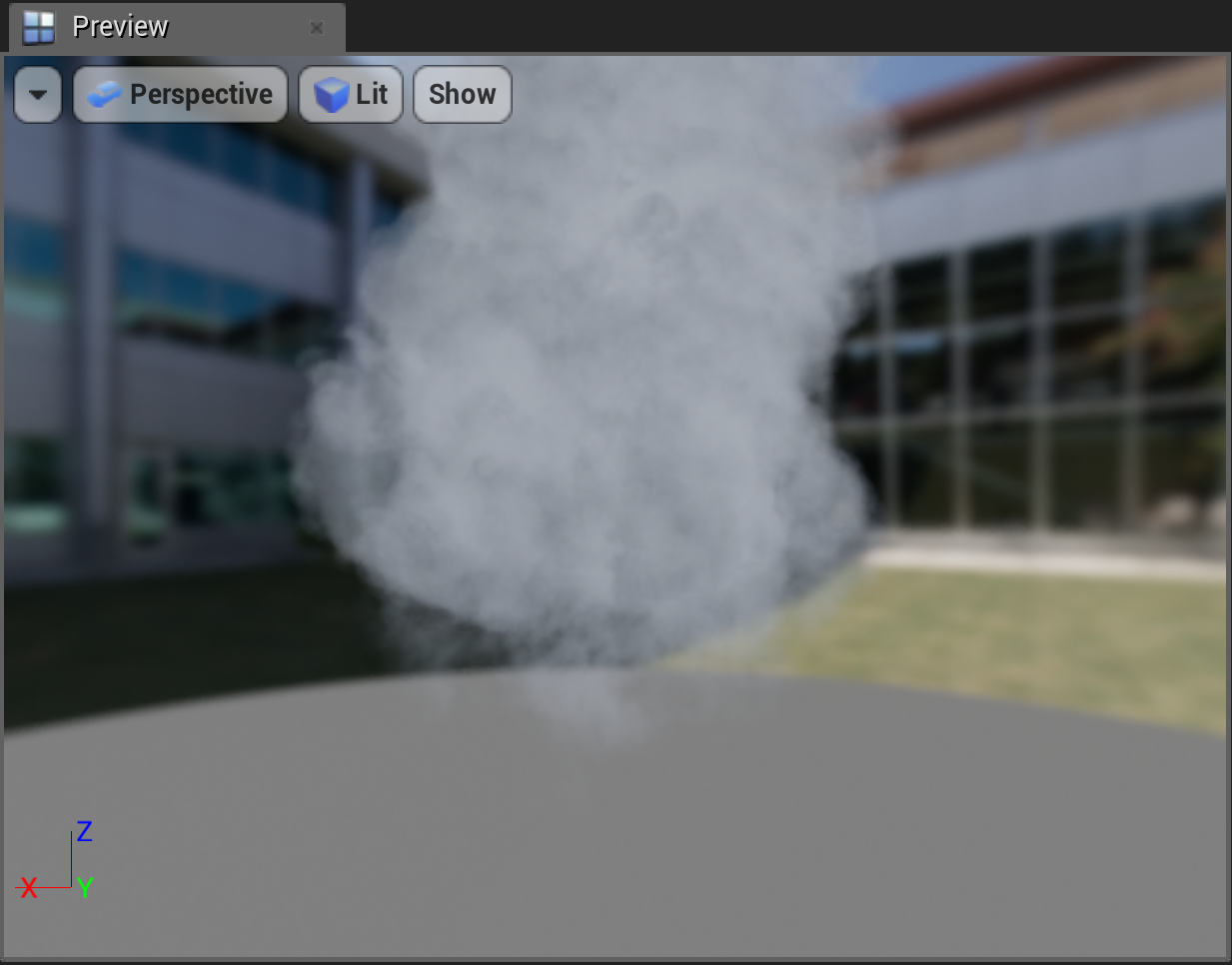
Click image for full size.
|
Menu Item |
Description |
|
|---|---|---|
|
Viewport Options |
||
|
Realtime |
Toggles real-time rendering in the viewport. Changes you make in the emitter stack will immediately be shown in the viewport, even if the emitter is not compiled. |
|
|
Show Stats |
Toggles showing stats in the viewport. If Realtime is not enabled, Show Stats automatically enables it. |
|
|
Show FPS |
Toggles showing the frames per second in the viewport. If Show Stats is not enabled, Show FPS automatically enables it. |
|
|
Field of View |
Changes the FOV of the viewport camera. This effectively zooms the lens of the camera in and out. |
|
|
Far View Plane |
Choose the distance to use as your far view plane. Setting this to zero acts as an infinite far view plane. |
|
|
Screen Percentage |
Sets the percentage of the screen your Preview panel uses. |
|
|
Viewpoint Type |
||
|
Perspective |
The default viewpoint used in the viewport. |
|
|
Orthographic |
Choose Top , Bottom , Left , Right , Front or Back . Selecting one of these changes the View Mode to Wireframe . |
|
|
View Mode |
||
|
Lit |
The default setting; it renders the scene with normal lighting. |
|
|
Unlit |
Renders the scene with no lights. No light maps, dynamic lights, static lights, or emissive materials affect the scene. |
|
|
Brush Wireframe |
Renders the scene in brushed wireframe. This displays the raw triangles of everything in the viewport, and turns off the back faces to make the scene more readable. |
|
|
Detail Lighting |
Renders the scene with detail lighting only. This means only lighting with normal data pulled from materials will be used. Color emitted from lights will affect the scene. |
|
|
Lighting Only |
Renders the scene with lighting only, and no textures. Only the vertex normals of the scene will be taken into account. |
|
|
Reflections |
Renders the scene with reflections only. This includes both reflection captures and Screen Space Reflections. |
|
|
Player Collision |
Renders a color-coded view of what a Player or Pawn can collide with. Static Mesh collision displays as green, Volumes as pink, and Brushes as a grayish-violet. |
|
|
Visibility Collision |
This setting will render a color-coded view of what Actors in the scene will block visibility traces. Static mesh collision displays as green, volumes as pink, and brushes as a grayish-violet. |
|
|
Optimization Viewmodes |
Select from the following options:
|
|
|
Level of Detail Coloration |
Select from the following options:
|
|
|
Show |
||
|
Grid |
Toggles the viewport's grid. |
|
|
Instruction Counts |
Toggles the display of instruction counts in the upper left corner of the viewport. |
|
|
Particle Counts |
Toggles the display of particle counts in the viewport. |
|
|
Emitter Execution Order |
Toggles the display of the order that emitters are executed in the viewport. |
|
Parameters Panel

Click image for full size.
This panel lists all the user exposed, system, emitter, particle, and engine-provided parameters (also called attributes ) that are used by the active emitter or system.
From the Parameters panel, you can drag and drop parameters to any appropriate node in the System Overview , or to any appropriate module parameter in the Selection panel. The number of times a parameter is referenced is shown on the right, enabling you to spot errors and make decisions on how to change your variables. If you have other emitters open, this panel pulls in data from those open emitters. This enables the user to share data between emitters. The Namespace for a parameter is displayed with a prominent icon, and you can see a tooltip that explains that Namespace when you mouse over the icon. To see more advanced Namespaces, such as parameter collections, click the Eye icon next to the Search bar.
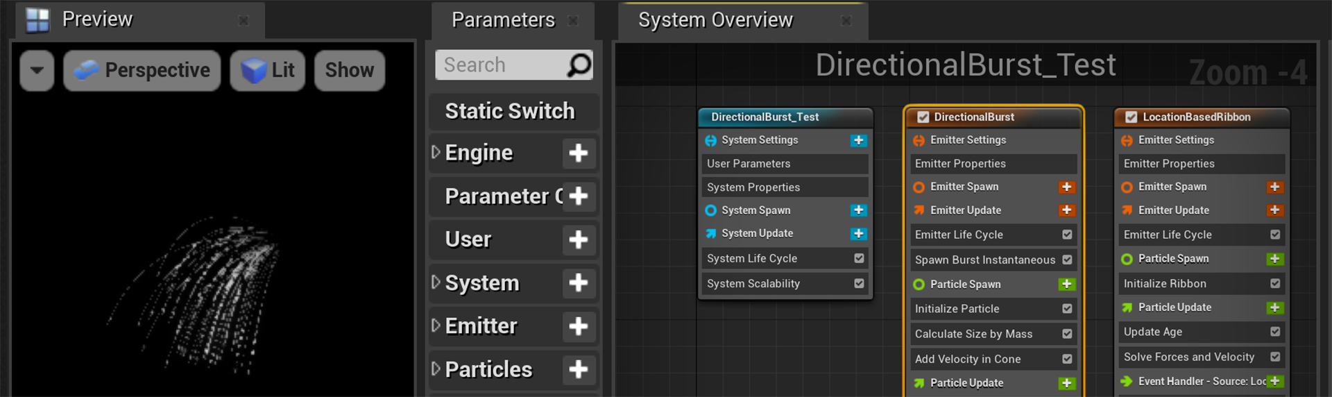
System Overview Panel

Click image for full size.
The System Overview panel gives a high-level overview of the system or emitter being edited, combining a pan-and-zoom Graph view with compact versions of the system or emitter stack. This panel makes it easier to navigate between different parts of the data, and it gives you a high level view when you open an emitter or system for the first time.
In a system, select an emitter in the Timeline panel and it will display the full stack for that emitter in the Selection panel. In this full stack view, the system information is on top, followed by the emitter module groups below. You can also get a full stack view of an emitter node or the system node by clicking on that node in the System Overview panel. However, if you want a less cluttered or more focused view, you can select an individual group or module within the emitter node in the System Overview to see just that group or module in the Selection panel.
System Node

Click image for full size.
The System Node has icons that identify each group of modules, as well as having colored dots next to modules that identify what that module or parameter affects.
Emitter Nodes

Click image for full size.
Emitter Properties has an icon that identifies whether the simulation is run on the CPU or the GPU. Other icons and colored dots on the emitter node help you identify the group, module, or parameter quickly.
Scratch Pad Panel

Click image for full size.
With the Scratch Pad , you can create reusable modules or dynamic inputs that are contained locally in the active emitter or system Asset. This makes it easier to design and implement new custom modules or dynamic inputs, because you can see the results immediately within the emitter or system. You can keep or discard these at will. Once you have the result you are looking for, you can copy-paste the script to an existing Asset. You can also save it as a new Asset by right-clicking Scratch Script Selector and selecting Create Asset . The Scratch Pad also allows you to make something that is very specific to the active emitter or system, and does not need to be made into its own Asset.
There are two ways to open the Scratch Pad panel in the Niagara Editor. You can open it from the Windows menu, the way you would show or hide any other panel. The disadvantage to this method is that when you use the Scratch Pad to build a custom module, you need to manually add that module to your overall emitter or system script in the System Overview. You also have to add the module or dynamic input starting shell yourself, by clicking the Plus sign icon ( + ) next to Modules or Dynamic Inputs .

Click image for full size.
The second way to open the Scratch Pad panel is to use the Plus sign icon ( + ) and selecting New Scratch Pad Module . This places a Scratch Pad module in your stack (wherever the new module will belong), which is automatically added to your script. You will also see that a shell for the new module or dynamic input is automatically added to your Scratch Pad Graph.

Click image for full size.
Selection Panel (the Stack)

Click image for full size.
In the Emitter Nodes and the Selection panel, the various groups are color-coded.
-
Orange is for Emitter-level modules. Orange sections are:
-
Emitter Settings : the Emitter Properties item is in this group.
-
Emitter Spawn : what happens on the first frame.
-
Emitter Update : what happens after the first frame, as the emitter is updated.
-
-
Green is for Particle-level modules. Green sections are:
-
Particle Spawn : what happens when the Particle is created.
-
Particle Update : what happens during the Particle's lifetime.
-
Update Age and Solve Forces and Velocity are normally low-level, boilerplate modules that everyone uses. But these can be removed and are completely optional.
-
-
Red is for Renderer items. Niagara decouples simulation from rendering. This means you can create simulation behavior once, then assign multiple renderers to that simulation.
If you select the System node in the System Overview, you will see system-related groups that are colored Blue .
-
System Settings : this group includes the User Parameters and System Properties items.
-
System Spawn : what happens when the system is created.
-
System Update : what happens during the system's lifetime.
The UI of the Niagara Editor is somewhat complex. The next two sections will highlight some specific elements of the UI that might be confusing to new users.
Groups in the Selection Panel

Click image for full size.
When you click on a group in an emitter or system node, that entire group is displayed in the Selection panel. To the right of the group name, you will see a Plus sign icon ( + ), colored to match the group. When you click that icon, a list of available module categories displays. Click the dropdown next to the category name to expand it and see the modules in that category. Selecting the name of a module adds that module to the group.
You can also click the Plus sign icon in the emitter or system node, directly in the System Overview. The same list will display.
Modules in the Selection Panel

Click image for full size.
Depending on the module, you may want to modify a parameter value to achieve a specific outcome. To add a dynamic input, expression, or link to another attribute you can click on the dropdown arrow to the right of the value field you want to modify. A list of available categories displays. When you expand the category, you can select from a list of available options and the selected option will be applied to that value field. For example, to randomize a value you can click the dropdown and select Dynamic Inputs > Random Ranged Float .
If you don't see a module or dynamic input you have created in the list, try unchecking Library Only .
Timeline Panel

Click image for full size.
With the Timeline panel, you can manage looping, loop count, bursts, random starts and stops, and spawn rate. All of these elements can interact right in the Timeline.
In a system, the Timeline panel lists all emitters active in that System, with metadata about what kind of renderers they use and the ability to toggle which emitters are active. You can control looping behavior using the Timeline, and you can set spawn burst keys in it as well. This is driven by module metadata, which can be extended by users if needed.
For more information on using Sequencer, see Sequencer Editor .
Curves Panel
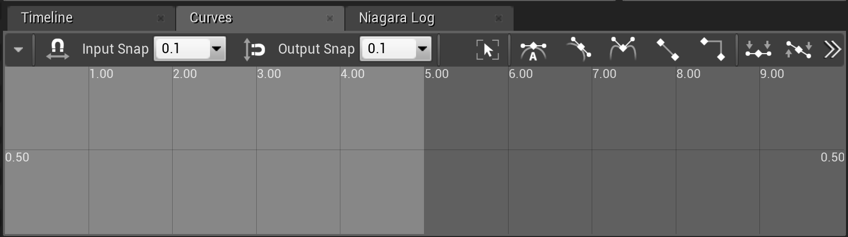
Click image for full size.
This panel provides a Curve Editor that enables the user to adjust any values that need to change during the life of a particle, or across the life of an emitter. In order for any property to be editable within the Curve Editor, that property will need to have a Distribution type that utilizes a curve, such as FloatfromCurve . For more information on working with Distributions, see the Distributions page. See the Curve Editor User Guide page for more details on using the Curve Editor.
Niagara Log Panel
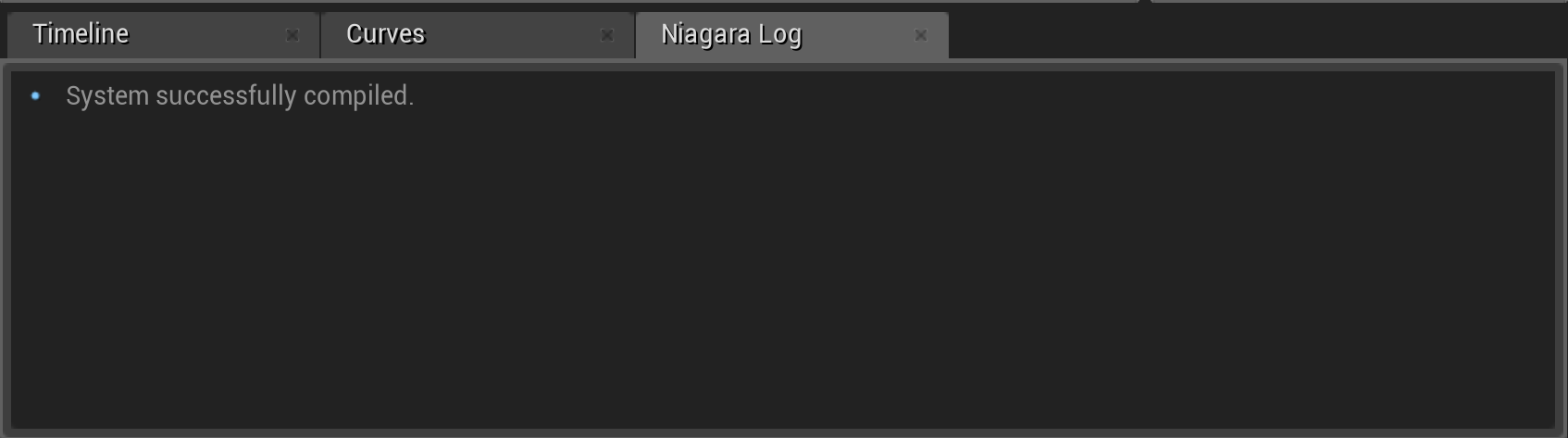
Click image for full size.
If there are any warnings or errors when compiling a script, emitter or system, they appear here. For many errors and warnings, you can click it in the Niagara Log panel and jump to the error's location in the Niagara Editor.
Other Optional Panels
There are some additional panels that are not displayed by default, but that can be opened using the Window menu. By default, these panels will display as tabs in the area where the Selection panel displays, but you can drag and drop them to dock them somewhere else.
Attribute Spreadsheet Panel

Click image for full size.
With the Attribute Spreadsheet , you can filter and debug information coming from the CPU or GPU simulation. For all CPU VM-based effects, you can take advantage of the attribute debugger. It allows you to see the inputs to the simulation as well as the per-particle computed values.
The Attribute Spreadsheet targets the emitter or system previewed in the Preview panel. You can also target systems in a level by setting the in-level system to Force Solo , then selecting that system as a target in the Attribute Spreadsheet while you are in PIE (Play In Editor) mode.
Preview Scene Settings Panel

Click image for full size.
This panel contains settings for modifying the Preview panel.
Generated Code Panel

Click image for full size.
This panel displays the generated HLSL and Assembly code for the selected emitter and owning system. This enables you to view and search that code. This tool is for advanced users who need to debug problems that may be difficult to spot with other methods.
You can select the HLSL or Assembly code being displayed using the Scripts dropdown menu. To view a specific emitter's generated HLSL or Assembly code, follow these steps.
-
Select the emitter in the System Overview or Timeline panel.
-
Select the desired script under the Scripts dropdown menu in the Generated Code panel.